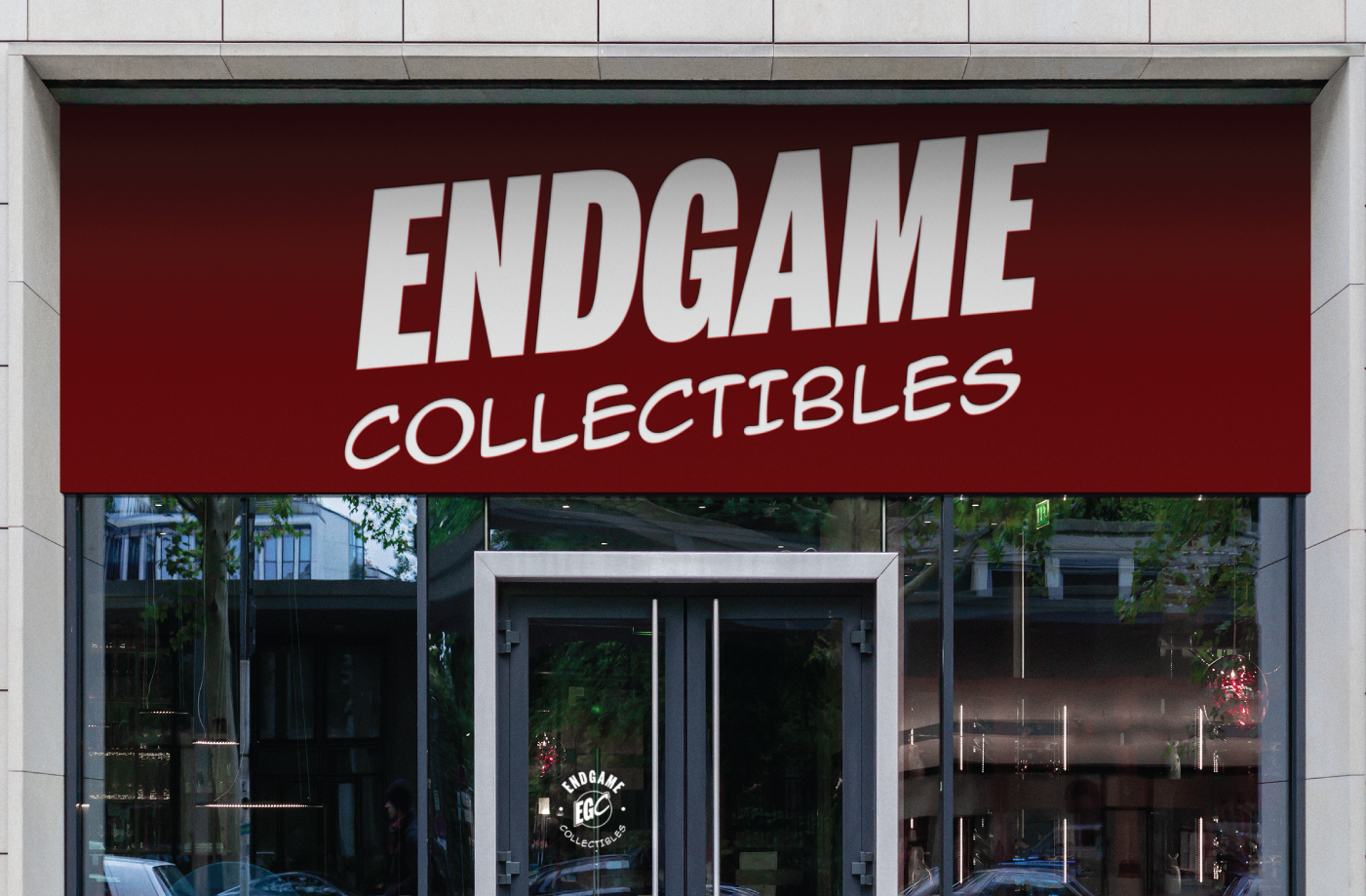
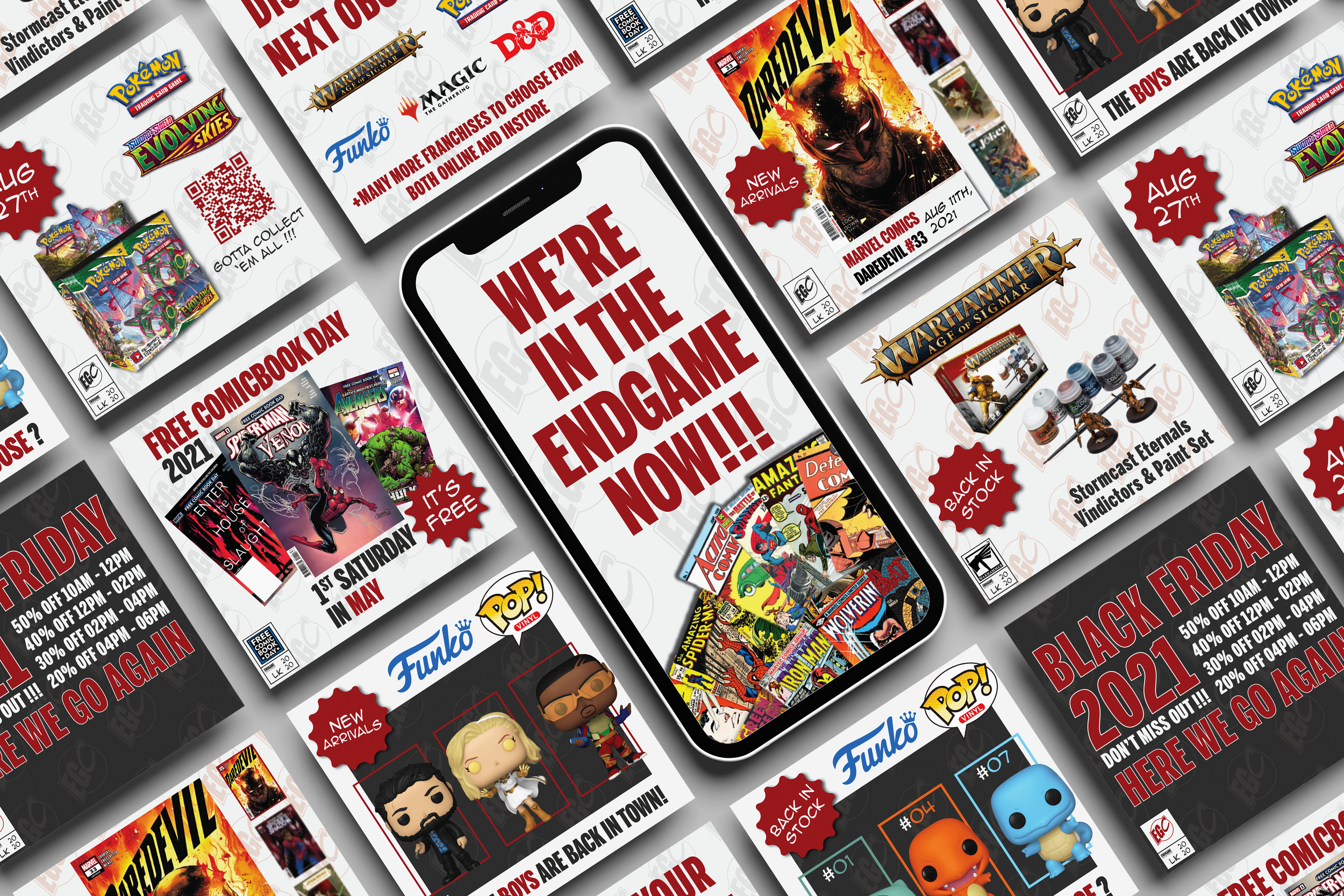
Endgame Collectibles formerly known as Sector 1 Comics & Collectibles wanted a full rebrand name and identity. They wanted to retain the comic book aesthetic but shift the tone to that of a more mature audience.
Their initial visual language was inspired by Superman, utilising the man of steel’s colour palette as well as likeness in their presentation. The client wanted a mature rebrand, focusing on anti-heroes like Deadpool, Dare Devil and The Punisher.
The result was a visual identity that harked back to the chrome age of Marvel. Simple text lifted straight off the pages. A mature colour tritone palette consisting of deep red, charcoal grey and neutral white.